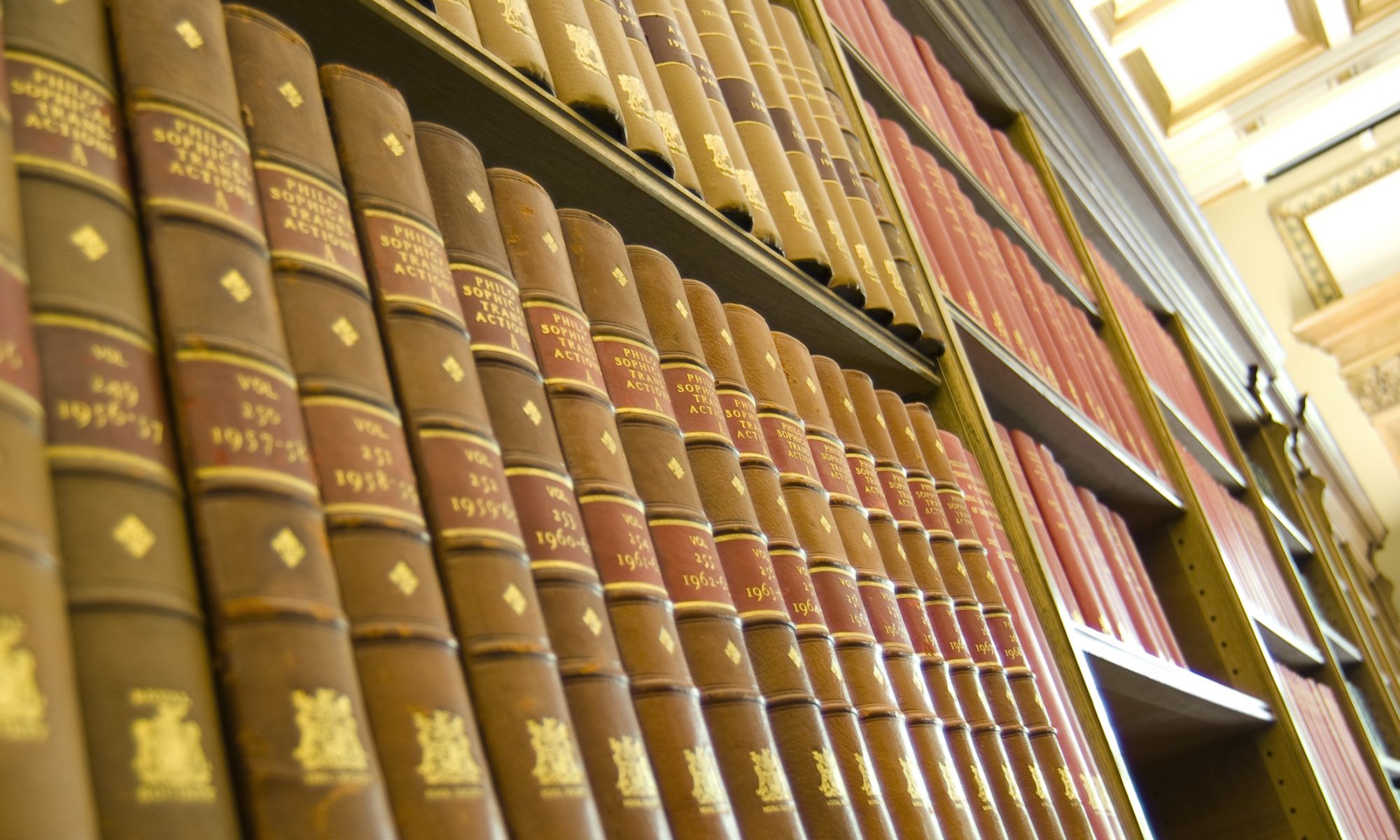
If you visit our home page, you can see the visual changes over time. First, the journal was of course black and white, with illustrations inside the journal rather than on the front page. From the 1990s, visual imagery on the cover became important and today glossy images draw the eye to the journal. It is interesting to note that for most of its long history, the Transactions remained visually the same, but since 1990 it changed numerous times. Today, each of the 11 journals have their own visual look, but each carries the Royal Society logo and specific fonts. Similarly, the Royal Society publishing website is becoming increasingly important as more and more readers access the journal online (where a lot of the content is also free). Images online do not always translate well from the printed page, and discussions have been had about using video and more modern tools to illustrate journal articles.
A History of Scientific Journals
Lessons from the history of Royal Society journal publishing, 1665-2015